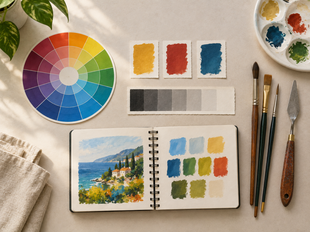
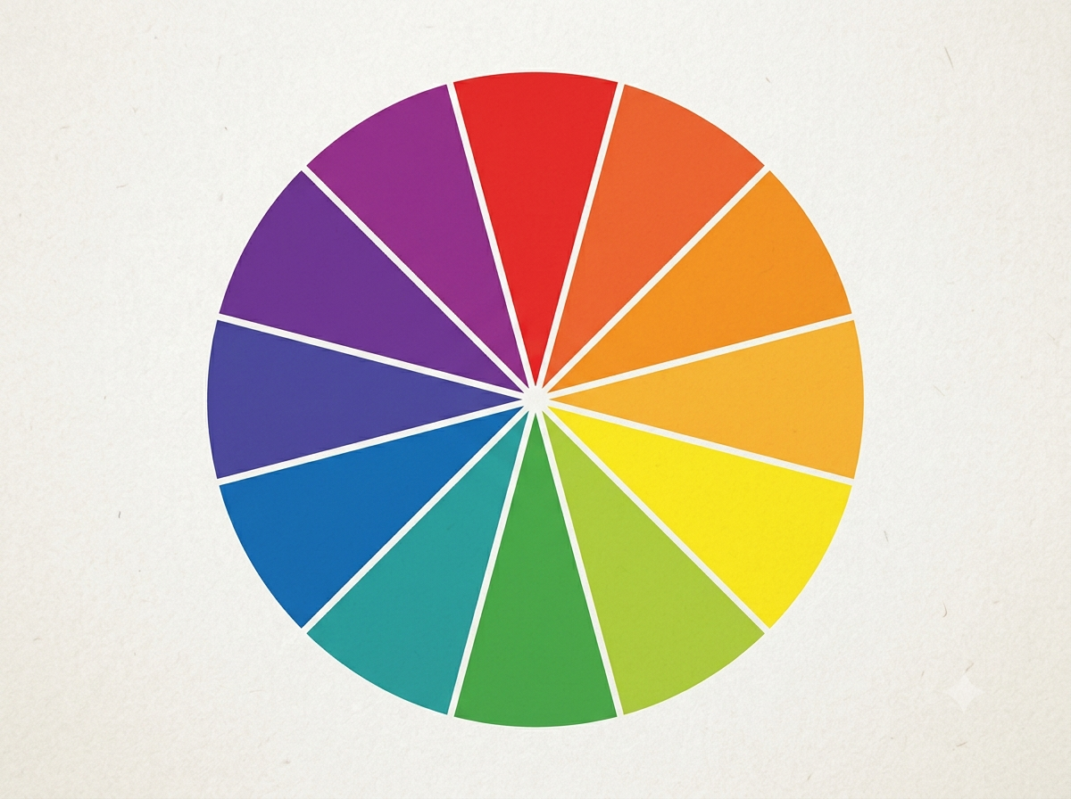
If you’ve ever stood in front of a blank canvas, paintbrush in hand, and wondered why two “perfect” colors suddenly clash the moment they touch, you’re not alone. Color is the most immediate, emotional, and technically nuanced element of visual art. It can make a composition breathe or suffocate it. And yet, many art students approach color through trial and error, hoping intuition will eventually lead to consistency.
It won’t. Not efficiently, anyway.
Colour theory isn’t a rigid rulebook; it’s a living framework that explains how colors interact, how they’re perceived, and how you can harness them intentionally. Whether you work in watercolor, acrylics, oils, gouache, or digital media, understanding the fundamentals will fast-track your progress from “hoping it looks good” to “knowing why it works.”
Below is a complete beginner’s guide to colour theory, structured the way you actually need it in the studio: clear, visual, and immediately applicable.
1. The Color Wheel: Your Map to Every Hue
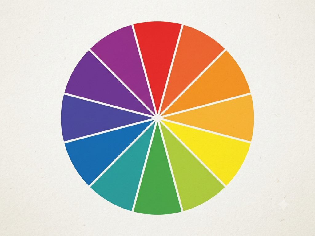
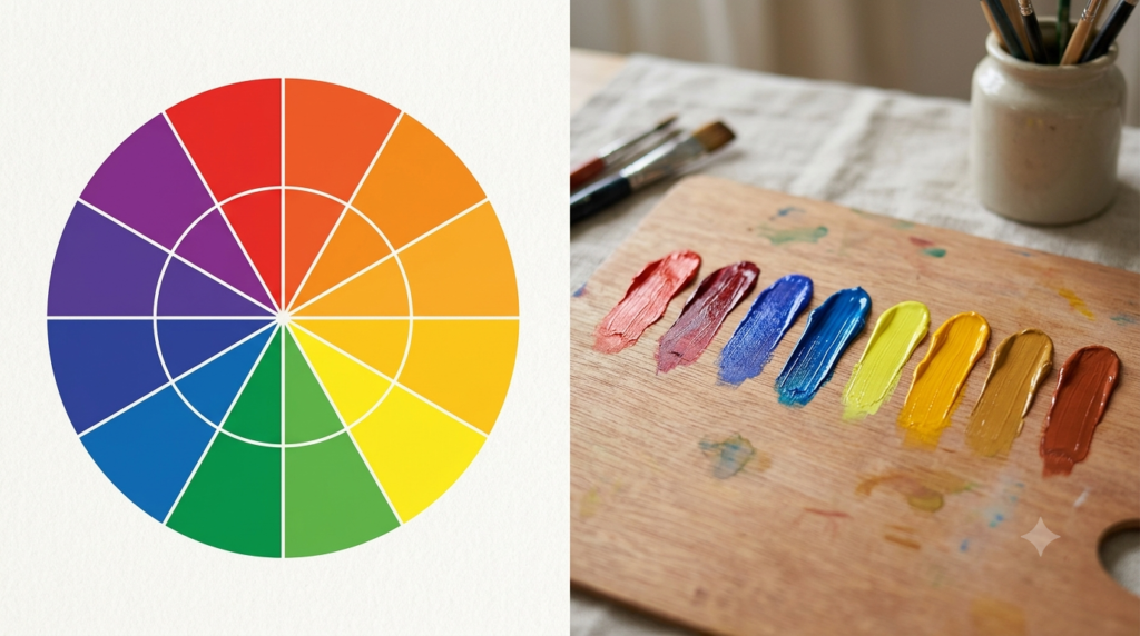
Every color conversation starts with the wheel. It’s not a mystical object; it’s a practical organizational tool that shows how hues relate to one another.
Primary colors are the starting point. In traditional art education, we use the RYB model: red, yellow, and blue. These can’t be mixed from other pigments, which is why they sit at the foundation.
Secondary colors emerge when you mix two primaries:
Red + Yellow = Orange
Yellow + Blue = Green
Blue + Red = Violet
Tertiary colors fill the gaps between primaries and secondaries, created by mixing a primary with an adjacent secondary:
Red-Orange, Yellow-Orange, Yellow-Green, Blue-Green, Blue-Violet, Red-Violet
The wheel is a reference, not a cage. Real pigments are messy. A cadmium yellow behaves differently from a lemon yellow; ultramarine blue leans violet, while phthalo blue leans green. Learning your actual paints—how they mix, stain, or mute—is the real work. The wheel simply gives you the vocabulary to talk about it.
2. Color Harmonies: How to Make Colors Sing Together
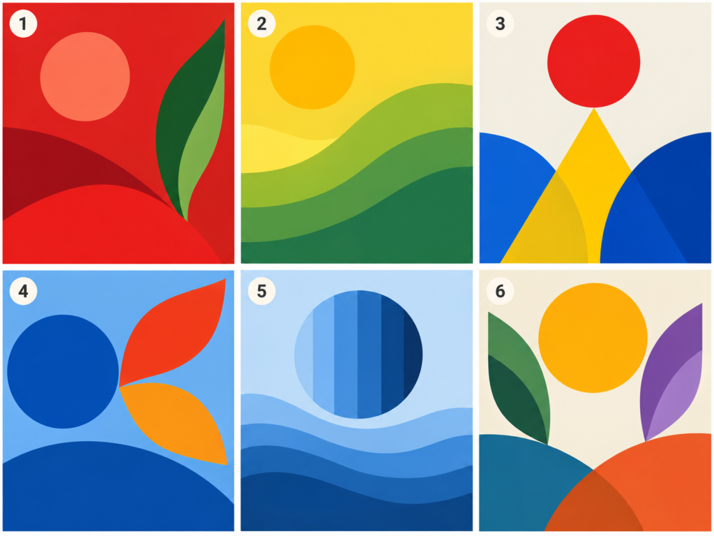
Harmony isn’t about making everything match; it’s about creating relationships that feel intentional. Here are the most useful schemes for art students:
Complementary: Colors opposite each other on the wheel (e.g., blue and orange, red and green). Complementary pairs create maximum contrast and vibration. Use them to draw the eye, but handle them carefully—placing pure complements next to each other at full saturation can cause visual fatigue. Mute one, or let one dominate, and the pairing becomes dynamic rather than aggressive.
Analogous: Colors that sit side-by-side (e.g., yellow, yellow-green, green). Analogous schemes feel cohesive, calm, and natural. They’re excellent for landscapes, atmospheric studies, and pieces where you want subtle transitions instead of sharp pop.
Triadic: Three colors evenly spaced around the wheel (e.g., red, yellow, blue). Triadic palettes offer variety with built-in balance. The trick is to designate one hue as dominant and let the others support, rather than giving all three equal weight.
Split-Complementary: A safer, more nuanced alternative to pure complements. Pick a base hue, then use the two hues adjacent to its complement. You keep the contrast without the tension of a direct clash.
Monochromatic: One hue explored through shifts in value and saturation. Monochromatic studies are brutally effective training tools. They force you to rely on value, edges, and temperature instead of leaning on color variety for interest.
3. The Three Dimensions of Color: Hue, Value, Saturation
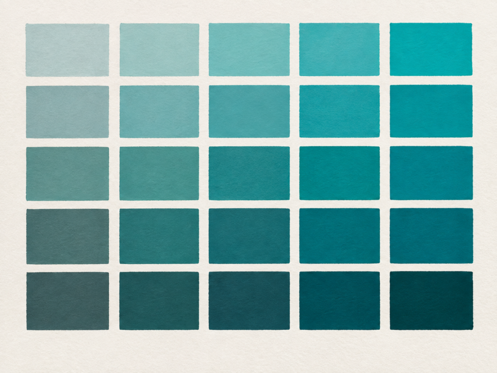
Beginners often fixate on hue (“Which red should I use?”), but professional-looking color decisions live in three dimensions: hue, value, and saturation (sometimes called chroma).
Hue is the color family itself—red, blue, ochre, teal. It’s the most obvious attribute, but rarely the most important.
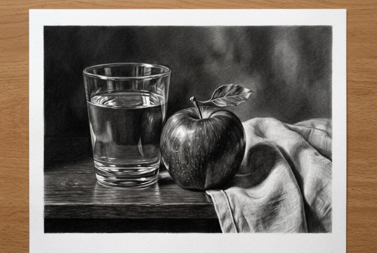
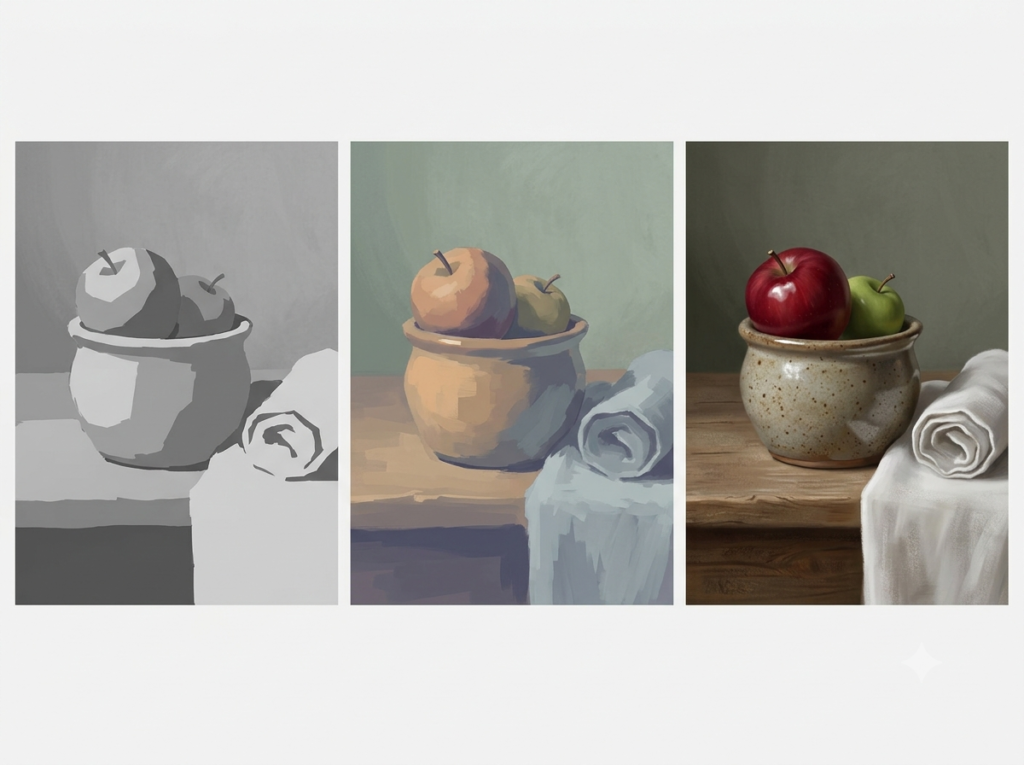
Value is how light or dark a color is. This is the backbone of readability. A composition with strong value structure will read clearly even in grayscale; a composition with weak value will collapse, no matter how “beautiful” the hues are. Learn to squint, use a grayscale filter, or photocopy your work in black and white to test your value architecture.
Saturation is the intensity or purity of a color. Fully saturated colors grab attention; desaturated colors recede, mature, and let other elements breathe. Masterful paintings rarely use full saturation everywhere. They modulate intensity like a composer uses dynamics: loud in focal areas, quiet in support.
A practical exercise: take one tube color and create a grid that varies value (add white or water, or mix with a dark neutral) and saturation (add a touch of its complement or an earth tone). You’ll instantly see how one hue can generate an entire palette when you control these dimensions.
4. Warm vs. Cool & The Emotional Language of Color
Color temperature is one of the most powerful tools in composition, yet it’s frequently misunderstood. Warm colors (reds, oranges, yellows) tend to advance visually, suggesting energy, proximity, sunlight, or heat. Cool colors (blues, greens, violets) tend to recede, suggesting distance, shadow, calm, or chill.
But temperature is relative, not absolute. A red can be warm next to a violet but cool next to an orange. A blue can feel icy beside a teal but warm beside a cerulean with green bias. Learning to see temperature shifts within a single hue is what separates flat color from dimensional color.
Color also carries psychological and cultural associations. Red can signal urgency, passion, or danger; blue can feel serene, corporate, or melancholic; yellow can read as cheerful, caution, or anxious depending on saturation and context. These associations are tendencies, not laws. Use them as levers, not labels. A high-saturation yellow in a soft, diffused light feels completely different from the same yellow in a harsh, neon context.
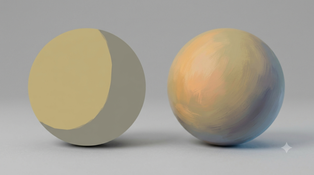
For art students, temperature is especially useful for modeling form and space. Even a “monochrome” piece isn’t truly single-temperature. Light areas often lean warm, shadows lean cool (or vice versa, depending on your light source). Introducing subtle temperature shifts makes surfaces feel rounded and environments feel atmospheric.
5. Putting Theory Into Practice: Tips for Art Students
Knowing the framework is one thing; using it in the studio is another. Here’s how to translate theory into habit:
Start with a limited palette. Fewer colors force smarter mixing. A classic limited setup might be a warm and cool primary pair plus an earth tone and white. Limiting your options reduces mud, speeds decision-making, and teaches you how pigments actually behave.
Mix with purpose, not panic. When a color turns muddy, it’s usually because complements are over-mixed or too many pigments are colliding. Mix on the palette, not on the canvas. Test swatches. Remember that mixing complements desaturates; if you want a rich dark, consider a dedicated dark pigment rather than over-mixing complements into a murky gray-brown.
Design with value first, color second. Block in your composition using a limited value range. Once the structure reads, layer in hue and saturation. This prevents the common beginner trap of pretty colors on a weak foundation.
Observe real light, not just tube labels. Paint what you see, not what the color name says. A shadow isn’t “black”; it’s often a darker, cooler, or more desaturated version of the local color, influenced by reflected light. A highlight isn’t “white”; it’s the lightest, often warmest or coolest point depending on the light source.
Digital vs. traditional: If you work digitally, the same principles apply, but saturation and value are easier to manipulate after the fact. That convenience can become a crutch. Train your eye by making deliberate choices early, not by fixing everything later with sliders.
6. Beginner Pitfalls (And How to Dodge Them)
Even with theory in hand, certain traps keep showing up in student work. Watch for them:
Over-relying on pure tube colors. Fully saturated pigments straight from the tube almost never appear in nature at full strength across an entire surface. Mix variations to create harmony.
Ignoring value in favor of hue. If your piece looks confusing in grayscale, the issue is value, not color. Fix the structure before adding more hues.
Equal visual weight everywhere. Every color decision competes for attention. Give one area dominance and let others support. Hierarchy creates clarity.
Skipping color studies. Quick, small studies are where theory becomes instinct. Do them often: limited palette landscapes, complementary portraits, monochromatic still lifes. The goal isn’t perfection; it’s repetition.
Conclusion: Color Is a Language. Learn the Grammar, Then Find Your Voice.
Colour theory won’t tell you what your painting should feel like. It will, however, give you the tools to make it feel that way on purpose. Once you can navigate the wheel, balance harmonies, control value and saturation, and use temperature to shape space, color stops being a gamble and starts being a choice.
Start small. Mix deliberately. Test in grayscale. Study the palettes of artists whose work resonates with you, not to copy them, but to reverse-engineer their decisions. The more you work with color intentionally, the more your intuition will be informed by knowledge rather than luck.
And remember: the best color isn’t the most vibrant or the most complex. It’s the color that serves the idea, guides the eye, and makes the viewer feel exactly what you meant them to feel.